An insider’s view: The not so good ole’ days
From September 2011 until mid-summer 2012, brandadvisors was actively engaged in helping revitalize the JCPenney brand with the mission of bringing back integrity, simplicity, and enjoyment to the retail experience. We’re proud of the role we played, the work that was implemented, and the ideas and innovations that unfortunately didn’t come to life. Amongst our first tasks was revitalizing the brand identity for the iconic 112-year-old company. The new logo mark was designed to support the vision of becoming America’s favorite store while also doing what any strong brand identity does: distinguish itself in a meaningful way. Objective outsiders had good things to say and a look at how the new mark stands out from its competitors is self evident. Despite the success and strategy behind the new mark, JCPenney announced last week that it would be discontinuing the use of the revitalized mark and returning to its old logo. While not surprising, it’s disappointing. Like a flare shot into the sky, the company stated that the move was meant to signal to its loyal-customers past that JCPenney is still here for them. Truly great brands deliberately manage every interaction between them and their customers, including their brand identity. Smart identities create powerful connections, especially when thoughtfully developed. And good strategy can make the design decision making process far easier and more effective. As the firm behind the JCPenney brand identity, below is our insider’s take on the logo, the current leadership’s decision, and more importantly, a contrarian and knowledgeable participant’s defense of JCPenney’s larger vision and strategy. branding 101 Strong brands have powerful identities that are distinctive, relevant, and memorable. Our analysis found that many of the brands within the general retail category utilized a word-mark that represented the company’s namesake founder. Very few utilized a distinctive name or a graphic symbol that set the brand apart (Target as the exception), and fewer (across many brands in general), had a clear story that connected the brand mark with the company positioning and strategy in a simple and compelling way. 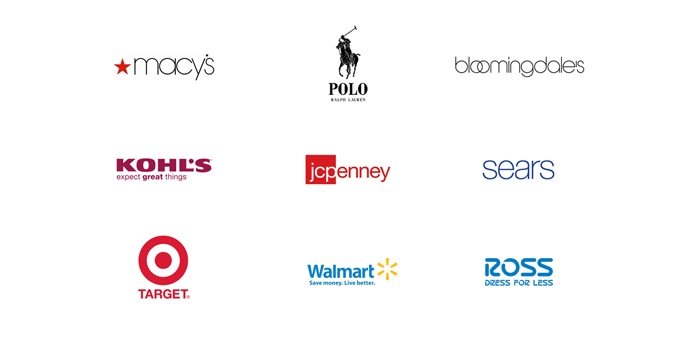 Symbol of change The brand launch, led by former CEO Ron Johnson, was driven by far more than a mere cosmetic freshen up. (If it could have, it may as well have ventured to its own Sephora counter). Instead, JCPenney had set out to change the way people shop, with the ultimate goal of becoming “America’s Favorite Store.” The company was to launch many significant initiatives that would make a meaningful and positive impact on the overall shopping experience, including an evolution of new products, services, and experiences. Ironically, the changes were meant to address many of the “bad-habits” adopted by retail over the years, and in turn, revive the traditional “old-school” characteristics and values that had historically made retail so great. Ron Johnson’s vision and direction for the brand was to return to the very values rooted in JCPenney’s 112 year old brand history—ever so relevant today—reflected by company founder James Cash Penney’s “Golden Rule” principle of treating people fairly and offering all Americans great products at a fair price. (Unfortunately, loyal JCPenney customers did not understand the ultimate intent, and that it would take time to implement). In developing the mark for a brand that set out to transform the category, brandadvisors’ task was to create an iconic mark that would stand out and withstand the test of time.
 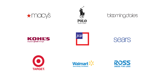 The new logo was crafted to signal change while also reinforcing many important brand values. While it was important to signal a meaningful shift to break through to entirely new audiences who hadn’t or didn’t even consider the brand, it was also important to reinforce to loyal customers that the identity was developed thoughtfully and with respect to the brand’s heritage. In creating an iconic mark, brandadvisors staked claim on a distinctive, meaningful, yet simple design element—the square—that metaphorically reinforced many of the brand’s distinct values and also responsibly leveraged a design element, which had been a part of the brand’s identity for decades.
 ![]() Natural evolution Among the many meaningful elements of the brand vision and promise that the square graphic reinforced was the CEO’s vision to become America’s Favorite Store and the brand’s “Fair and Square” positioning theme. The mark’s “square within a square” design clearly emphasized the “fair and square” theme, but also communicated “America” by harkening the image of our nation’s flag. The identity could then also serve as the rallying flag to drive behavior and culture within JCPenney by subtly suggesting and reinforcing the brand’s commitment to delivering core JCPenney and American values like integrity, honesty, authenticity, and optimism—values that had seemingly slipped away from the retail category over the decades.
Natural evolution Among the many meaningful elements of the brand vision and promise that the square graphic reinforced was the CEO’s vision to become America’s Favorite Store and the brand’s “Fair and Square” positioning theme. The mark’s “square within a square” design clearly emphasized the “fair and square” theme, but also communicated “America” by harkening the image of our nation’s flag. The identity could then also serve as the rallying flag to drive behavior and culture within JCPenney by subtly suggesting and reinforcing the brand’s commitment to delivering core JCPenney and American values like integrity, honesty, authenticity, and optimism—values that had seemingly slipped away from the retail category over the decades.  As a brand intended to serve all Americans with an ever-increasing range of exciting new products and services offering superior value, the “square” also served as an ideal graphic element to “showcase” products, services, and people: using the graphic as a framing element allowed the brand to brings focus to both print, digital, environmental, and in-store applications, just as we use frames to view the things we love.
  Since over 90% of the company’s private label brands sold for at least 40% off, Johnson believed that those products weren’t “brands” but were instead “labels.” To that end, Johnson and his team struck deals with true leaders of design to bring great products and amazing values from names like Jonathan Adler, Michael Graves, Sir Terrence Conran, bodum, Levis, Nanette Lapour, Martha Stewart, pantone, and IZOD, to name a few. If you’re still not convinced why the “square” was a smart strategic design element, remember that squares serve as building blocks, which reinforce JCPenney’s intentions to transform the retail category. Finally, because the retail category is known for its complexity and store environments are chaotic and overwhelming, squares are relevant by creating a clean and simple organizational element that can be applied to both 2-D and 3-D applications.
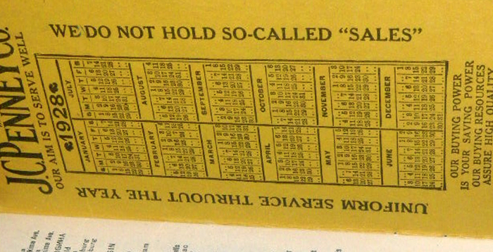
 Business Strategy vs. Identity Strategy Unfortunately, it’s going to take far more than a new logo to right the ship of JCPenney. One can see how JCPenney felt “going backwards” by resurrecting the old logo could help undo the bad-will felt by alienated loyalists. However, resurrecting the old logo isn’t going to magically restore confidence with customers who felt abandoned or at minimum, unclear about what JCPenney was or is trying to become. It’s understandable that by taking away the “new flag” associated with the prior administration’s actions and returning to the “old flag,” JCPenney’s former loyal clients could have an easier way to identify with the brand they once loved. But, going back to “the good old days” of sales and coupons puts JCPenney in a sea of sameness, competing with brands like Walmart, Sears and Kmart, where price is the tool of choice to drive traffic and sales. At a time of financial crisis and a need for focus, changing a logo for the third time in as many years is a distraction. The real challenge for the company is defining a strategy that allows JCPenney to stand for something meaningful and distinctive, and to that end, coming to grips with and staying focused on the ideal target customer. From the beginning of Ron Johnson’s term, JCPenney’s strategy hinged on bringing a whole new set of customers to the stores, while of course, maintaining their loyal shoppers. To appeal to new buyers, showcasing exciting new brands and a totally revitalized store experience was a big part of the answer. That was going to take time. For both old and new customers alike, it was also incumbent on JCPenney to clearly communicate their value proposition. History proves that JCPenney’s former customers didn’t understand the pricing strategy, and even if they did, were accustomed to the allure of sales and coupons, a drug habit hard to kick. In hindsight, the real question is whether JCPenney should have sought to serve their old clientele, an audience who only shopped when incentivized by sales and coupons? Perhaps they should have instead focused on new customers, as did Target and Ikea, who proved that sporadic sales and the coupon craze need not be the primary tactic to get customers to the mall each weekend. While the industry has eviscerated JCPenney’s former leaders and the company for its actions, our research into the history of the company does provide some provocative material. Published in the company’s internal communications in 1928, brandadvisors found messaging and communications that raise shocking similarities and relevance to JCPenney’s strategy of old with Johnson’s recent strategy and today’s clear market values for integrity, simplicity, accessibility, value, and fun. What’s more, the company’s pricing strategy also must say something about what made JCPenney successful for years through “everyday low pricing”—in place years before Walmart even existed.
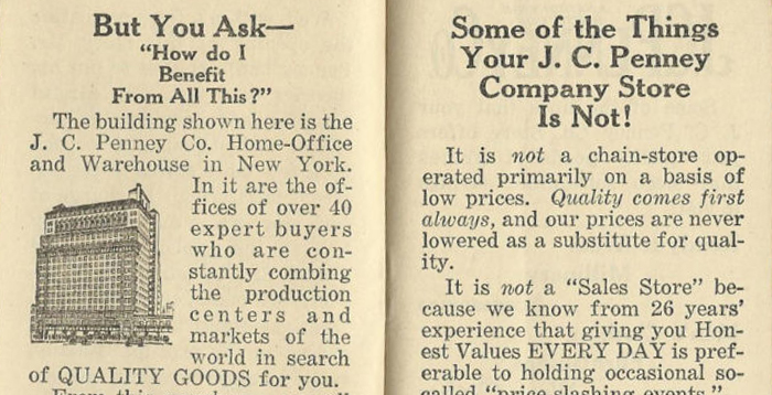
 If JCPenney could have better linked the launch of the new brand identity with substantive changes to the product lines, a re-imagined store experience, new services delivered both through technology and people, and a more unified and clearly communicated value proposition, then perhaps one of the biggest chapters in retail history may have been rewritten. For the time being, JCPenney has in fact gone backwards to resurrect its logo, but perhaps has ignored a deeper part of its history when it comes to the lessons learned as the founders of everyday low pricing, as best as we can tell!